M2M Ferries
Enhancing the ticket booking process on M2M Ferries website.
Usability Testing
Re-design
Information Architecture
Addressed usability issues causing delays in the ticket booking process and task abandonment resulting in a 51% reduction in completing the ticket booking process.
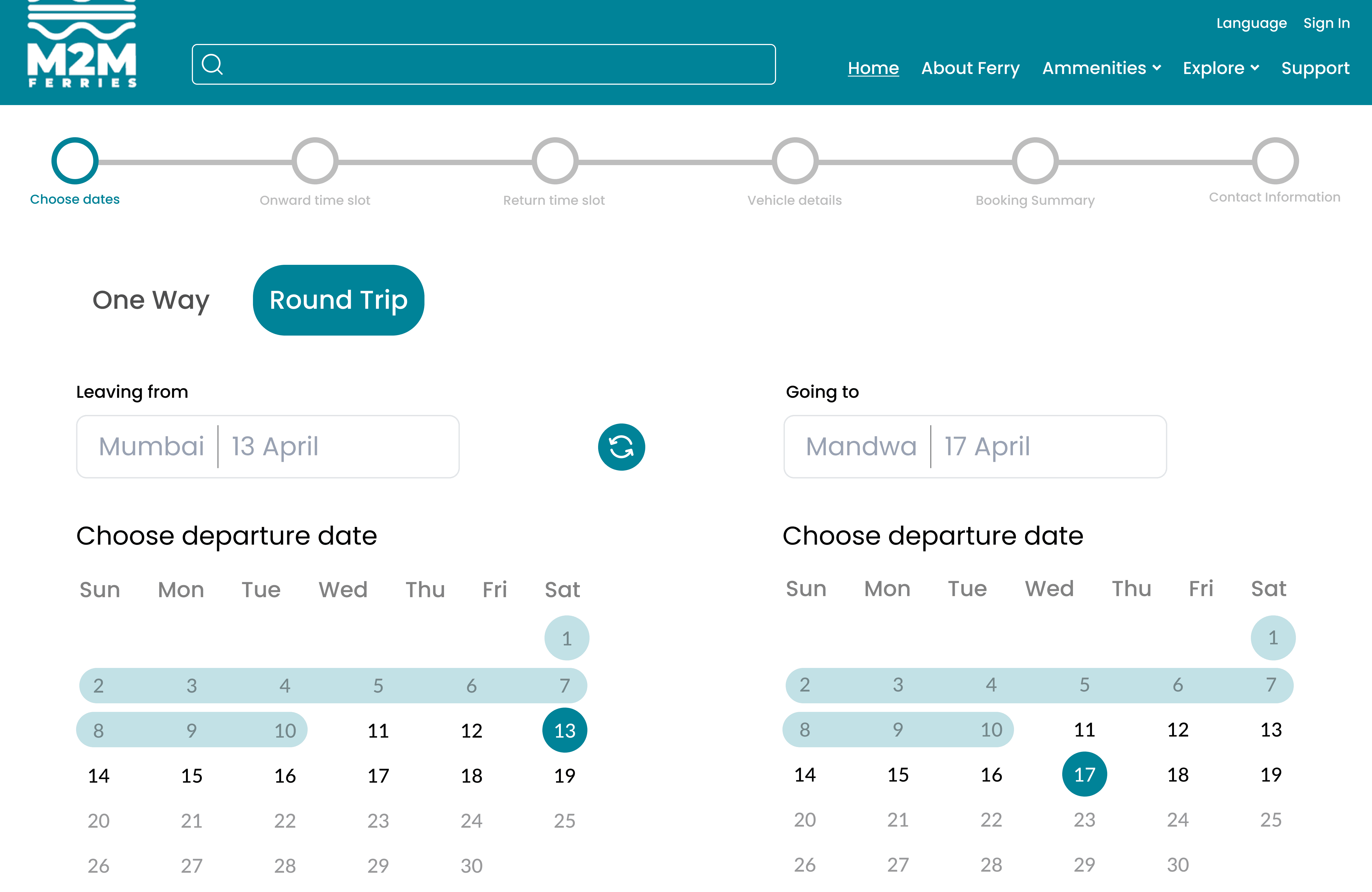


M2M Ferries
Enhancing the ticket booking process on M2M Ferries website.
Enhancing the ticket booking process on M2M Ferries website.
Information Architecture
Re-design
Usability Testing
Addressed usability issues causing delays in the ticket booking process and task abandonment resulting in a 51% reduction in completing the ticket booking process.
Timeline
Timeline
12 Weeks
12 Weeks
12 Weeks
Role & Responsibility
Heuristic Evaluation
User Survey
Interviews
Wire-framing
Prototyping
Information Architecture
User journey map
Research report
Concept sketches
HiFi Prototype
User persona
Team
Project Manager
Developer
UX Designer/ Researcher (Myself)
Sharvil Kotian - UX Researcher
Rucha Naik - UX Researcher
Nishad Patne - UX Researcher
Tanmay Godekar - UX Researcher
Myself- UX Researcher & Designer
Context
Context
M2M ferries has a website for purchasing tickets for ferry service.
M2M ferries has a website for purchasing tickets for ferry service.
The M2M Ferries website offers details on the RO-PAX ferry service that runs from Mumbai city to Mandwa port and back again. On this website, one may purchase tickets and find more about the different onboard amenities including food and seating.
The M2M Ferries website offers details on the RO-PAX ferry service that runs from Mumbai city to Mandwa port and back again. On this website, one may purchase tickets and find more about the different onboard amenities including food and seating.
The M2M Ferries website offers details on the RO-PAX ferry service that runs from Mumbai city to Mandwa port and back again. On this website, one may purchase tickets and find more about the different onboard amenities including food and seating.


Problem & Goals
Visitors are not staying on the website long enough to complete desired actions.
Visitors are not staying on the website long enough to complete desired actions.
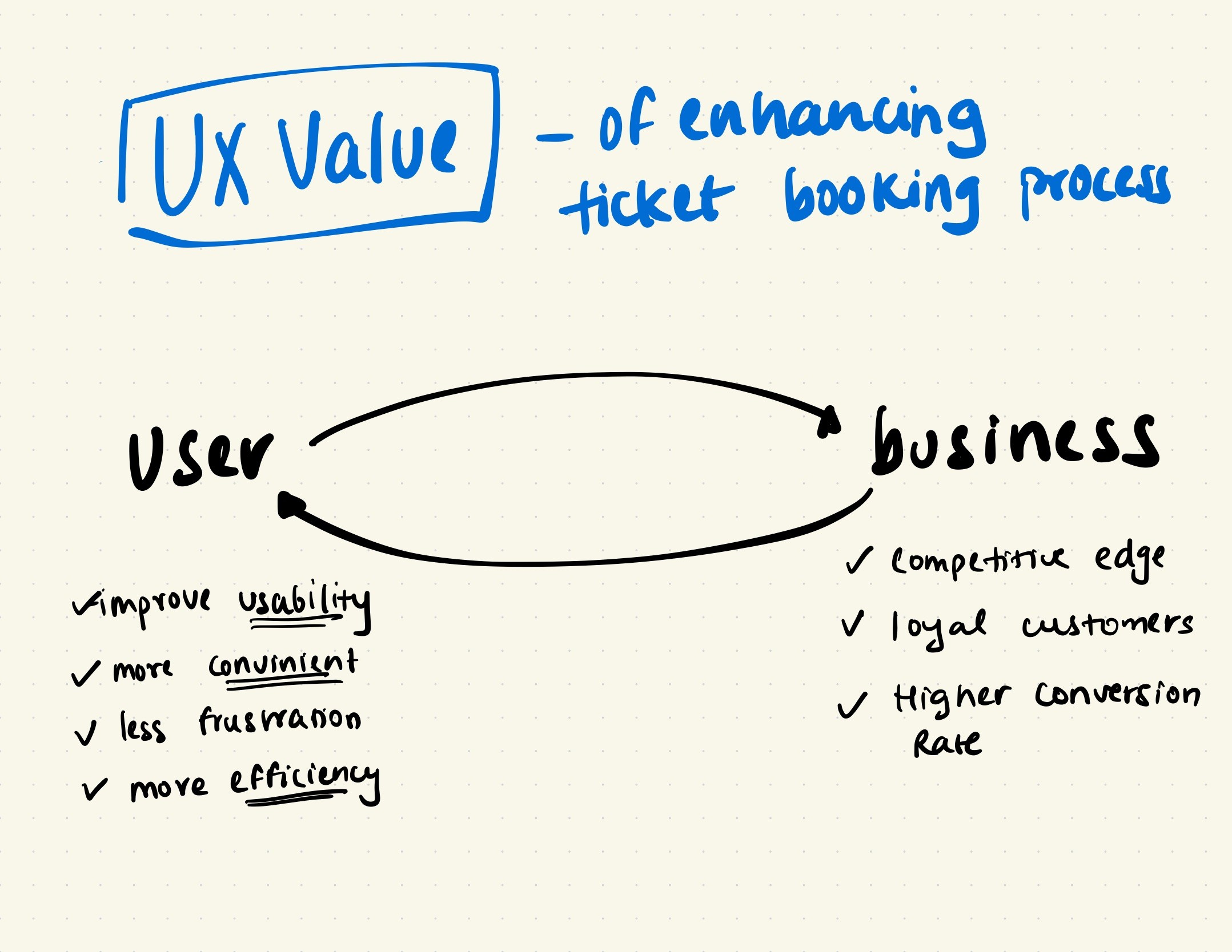

In the meeting with Project Manager and stakeholders we identified two major problems with the website. My goal was to identify the cause behind it and recommend solutions.
In the meeting with Project Manager and stakeholders we identified two major problems with the website. My goal was to identify the cause behind it and recommend solutions.
Low user engagement with the ticket purchasing feature.
High bounce rate.
Research
Understanding existing problems with interface through user research.
Understanding existing problems with interface through user research.
Heuristic Evaluation
Out out all the issues uncovered, majority of them related to visibility of system status & error prevention.
Out out all the issues uncovered, majority of them related to visibility of system status & error prevention.
User Survey
We got lot of negative feedback on the ticket purchasing process, calling it too long and some didn't find the website legitimate.
We got lot of negative feedback on the ticket purchasing process, calling it too long and some didn't find the website legitimate.
Usability Testing
We asked participants to try purchasing tickets using the website. The task success rate was 77.8% which was less than than expected.
We asked participants to try purchasing tickets using the website. The task success rate was 77.8% which was less than than expected.
Show me the research behind this!
Approach
Collating feedbacks and insights from 3 research methods.
Collating feedbacks and insights from 3 research methods.


Mapping relation between duties, goals and pain-points of researchers
Mapping relation between duties, goals and pain-points of researchers
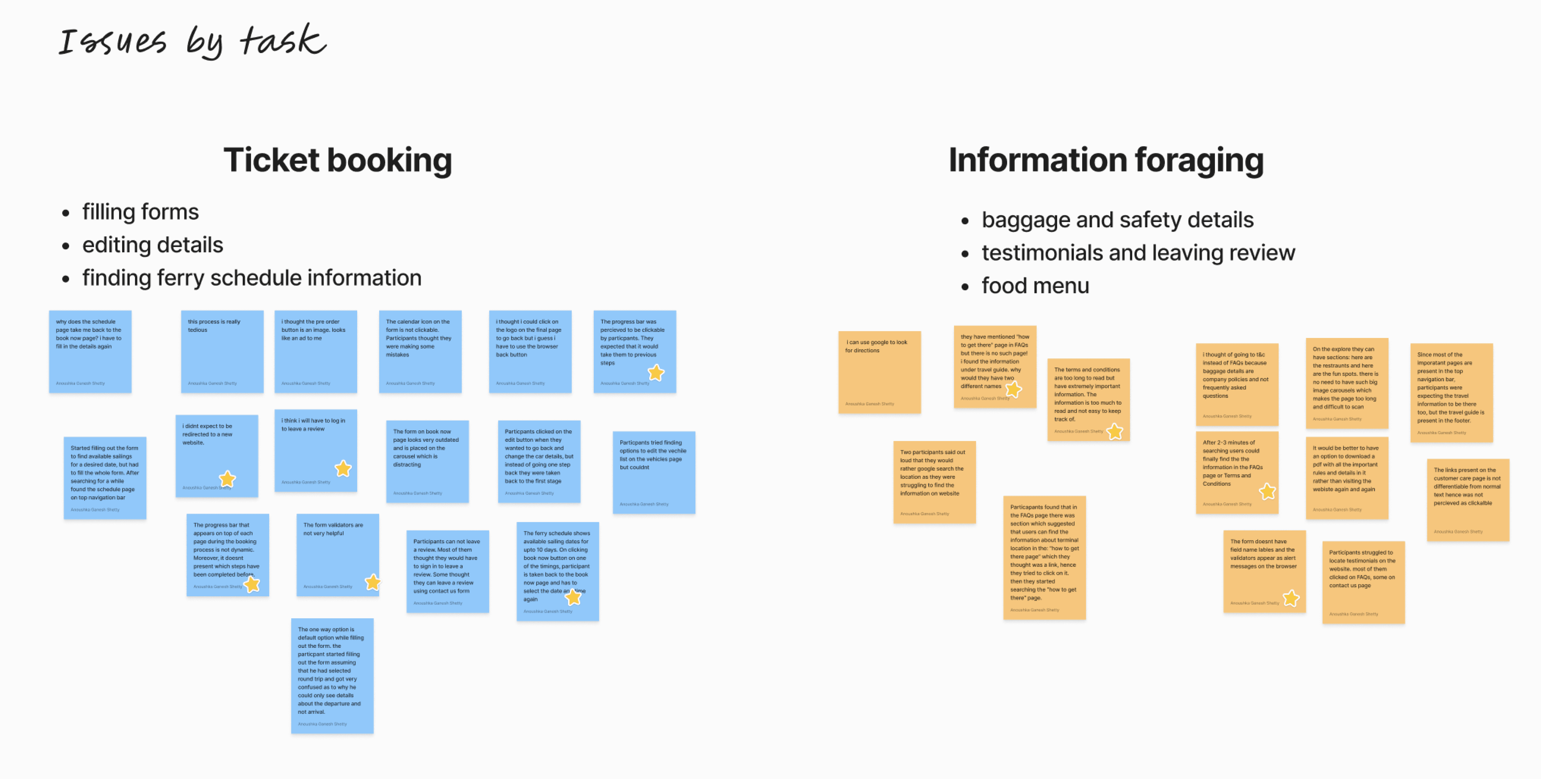
I did affinity mapping to segregate issues to discover that most problems fall under two buckets: ticket booking process and information foraging.
I did affinity mapping to segregate issues to discover that most problems fall under two buckets: ticket booking process and information foraging.
🏆 Enhancing the ticket form was identified as the top priority due to its significance as the primary tool on the website and concerns raised by stakeholders.
How might we?
Better the experience of booking tickets for people who travel by ferry frequently.
How might we?
Better the experience of booking tickets for people who travel by ferry frequently.
Mapping out new user flow which is faster and easier to understand.
Mapping out new user flow which is faster and easier to understand.
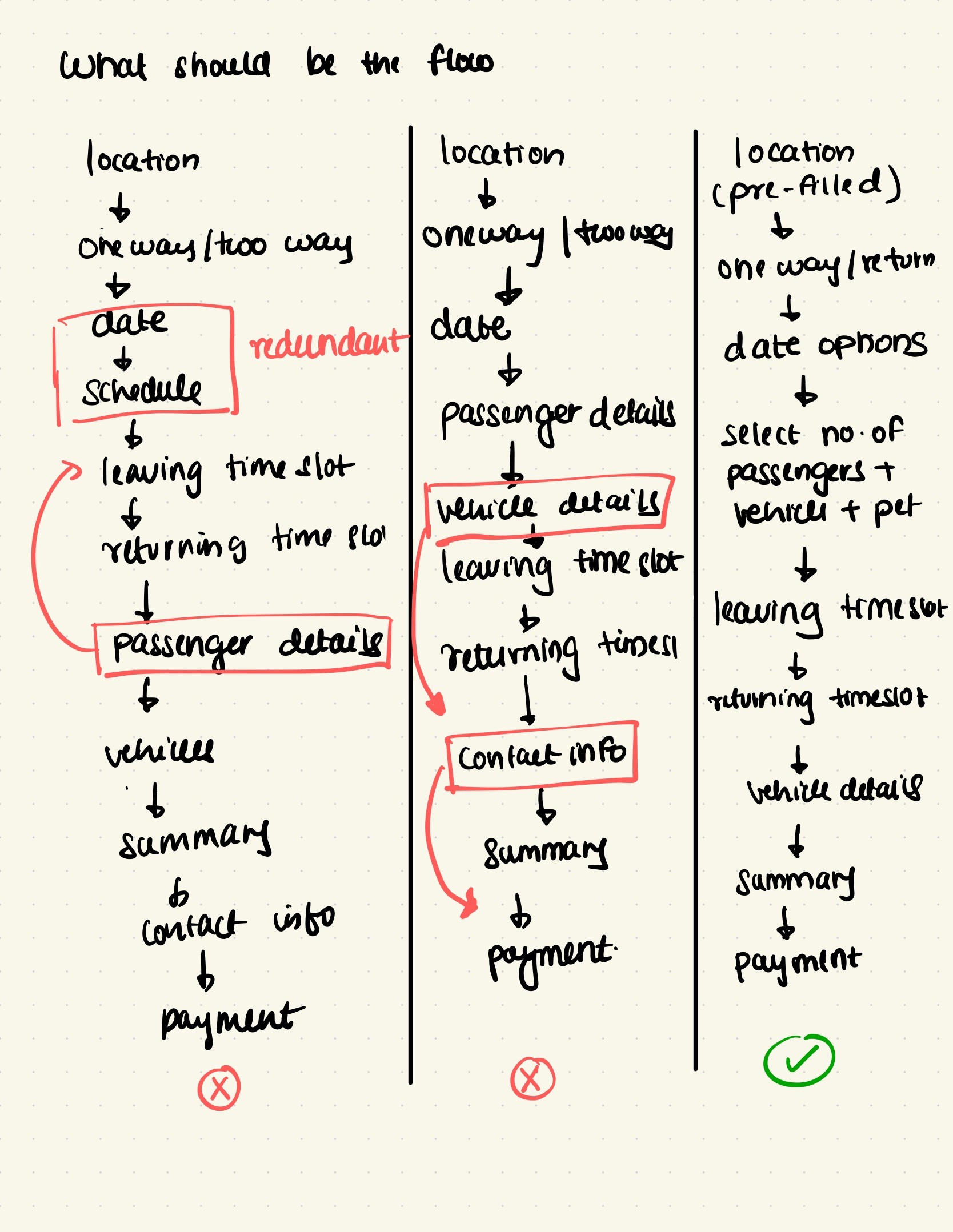


I made sure that the new user flow sticks to the following rules:
I made sure that the new user flow sticks to the following rules:
Flow should be intuitive.
Flow should be intuitive.
Flow should be intuitive.
No repetitive steps.
No repetitive steps.
No repetitive steps.
Information fed by the user in previous steps should reflect in the next steps.
Information fed by the user in previous steps should reflect in the next steps.
Information fed by the user in previous steps should reflect in the next steps.
User should put their personal Information only when all the cost and details of the booking are shown upfront.
User should put their personal Information only when all the cost and details of the booking are shown upfront.
User should put their personal Information only when all the cost and details of the booking are shown upfront.
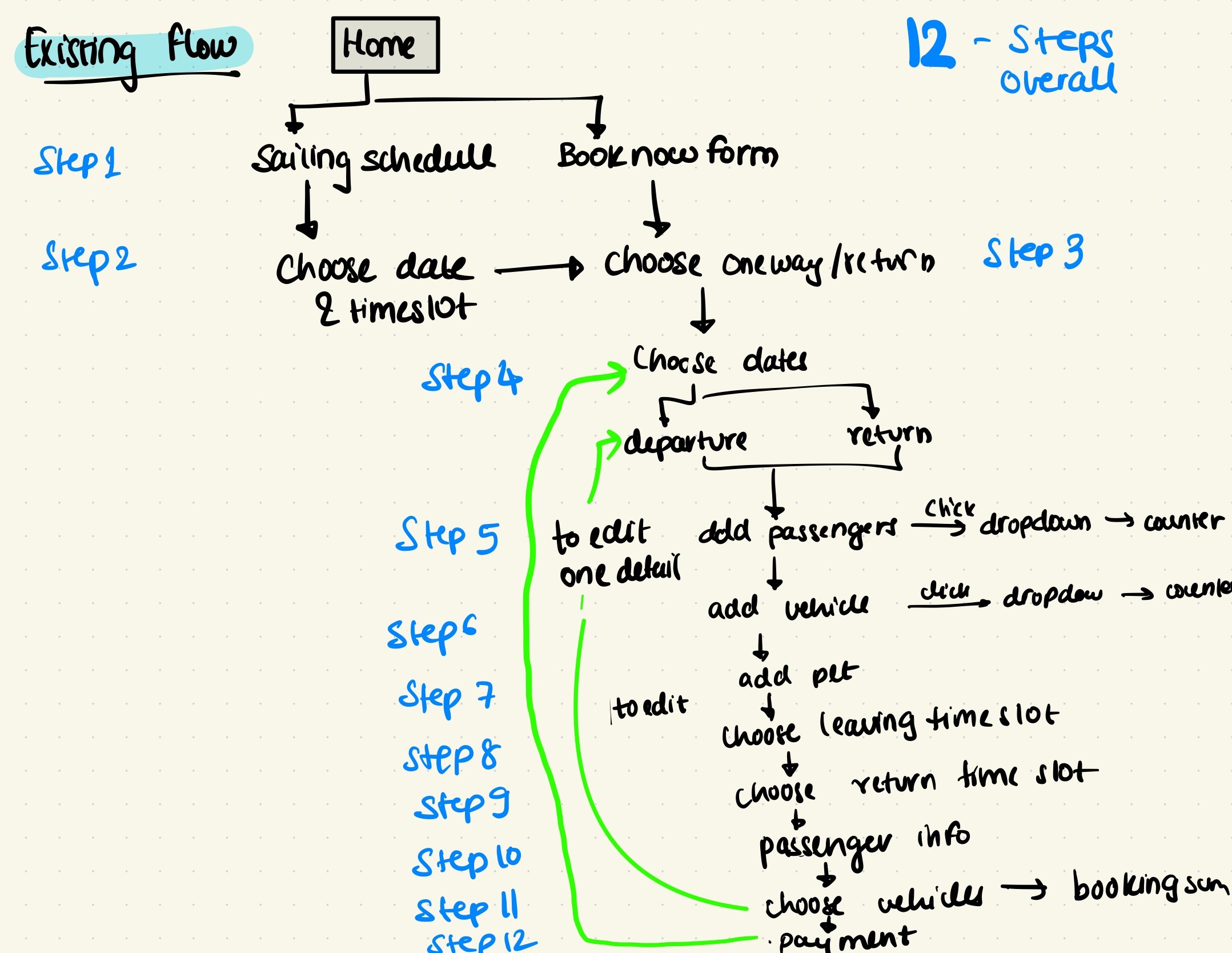
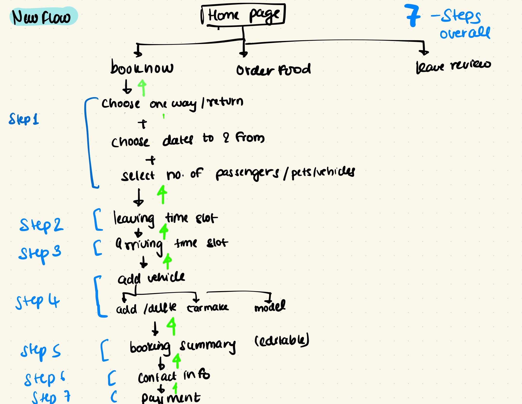
Revised ticket form navigation simplifies the process with fewer required steps.
Revised ticket form navigation simplifies the process with fewer required steps.
The process was streamlined by condensing 12 steps into 7 steps, allowing users to revisit previous stages for adjusting details, and ensuring a sequential order without redundancy.
The process was streamlined by condensing 12 steps into 7 steps, allowing users to revisit previous stages for adjusting details, and ensuring a sequential order without redundancy.




Reimagining the experience
Reimagining the experience
Cleaner UI, more white space and streamlined process
Redesign
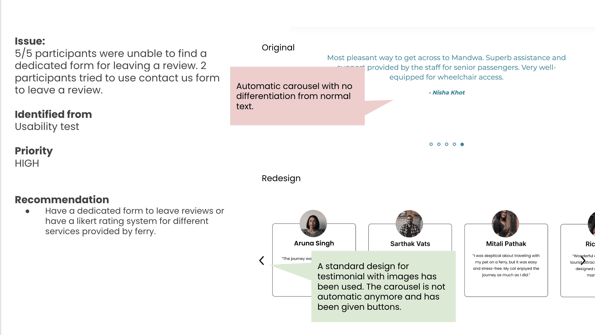
Original


Redesign
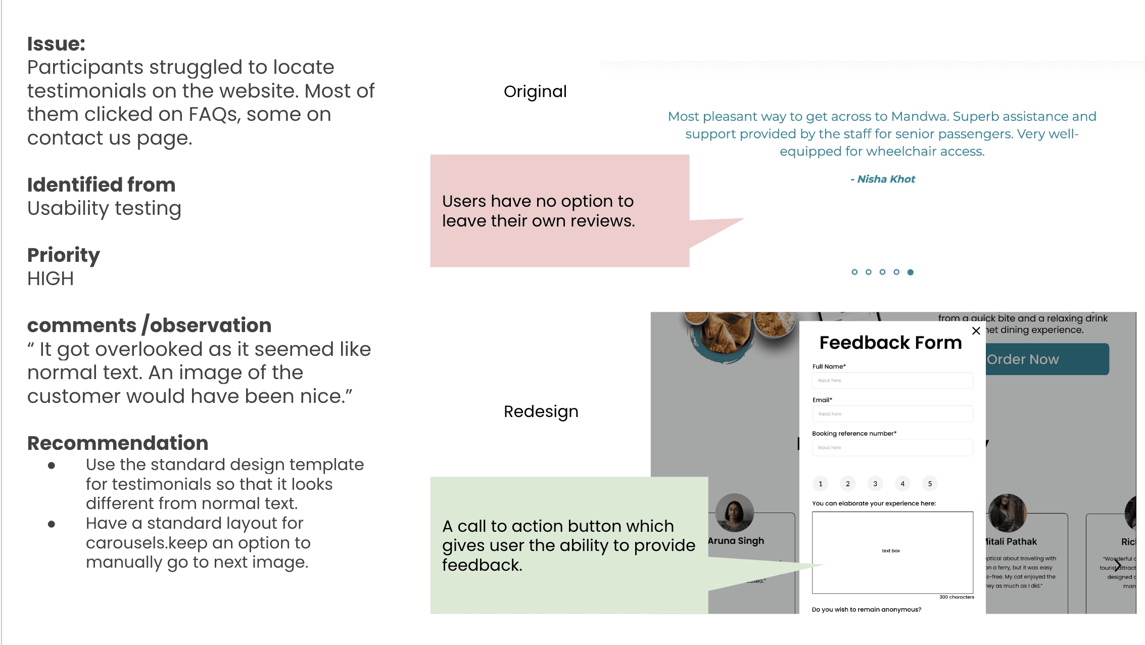
Original

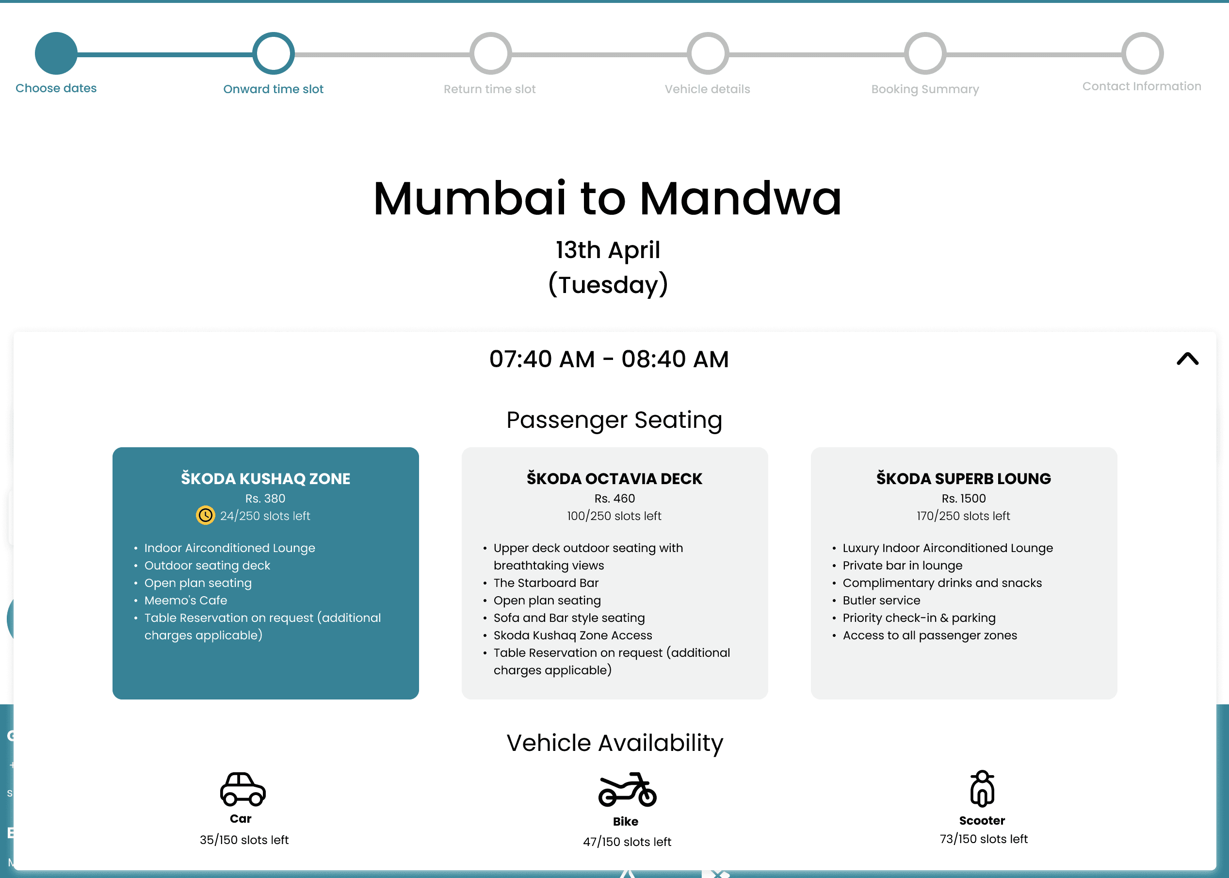
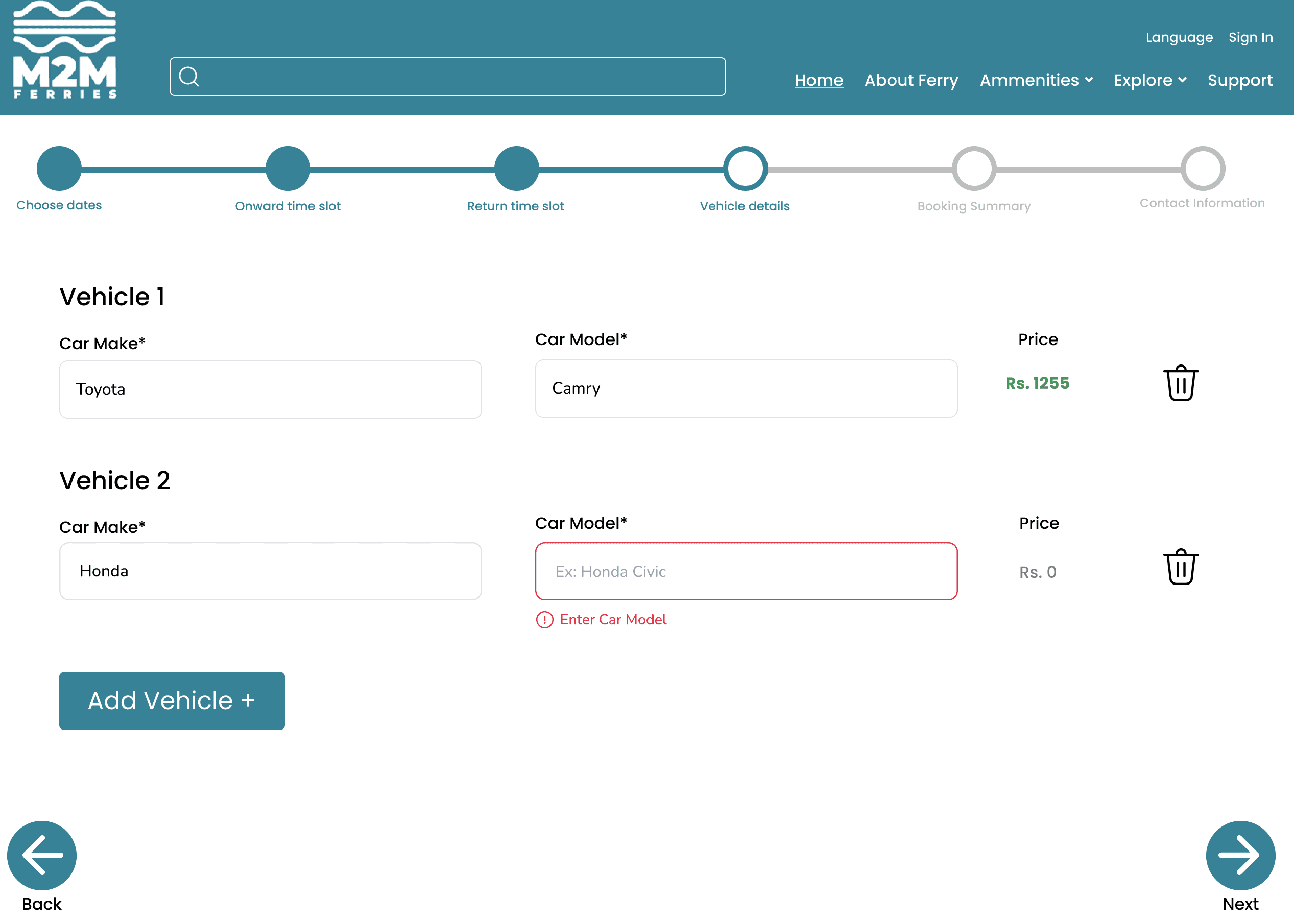
Offering users the ability to navigate back and make changes effortlessly.
Clear indication of mandatory steps
Redesign
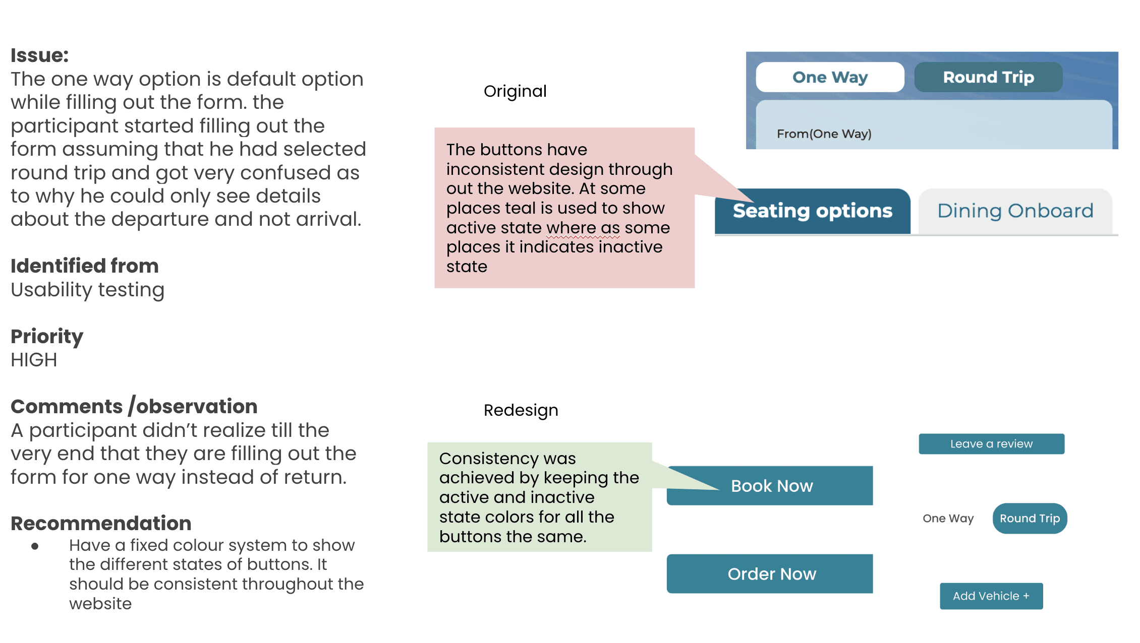
Original
Redesign
Original

Clear indication of mandatory steps
Offering users the ability to navigate back and make changes effortlessly.
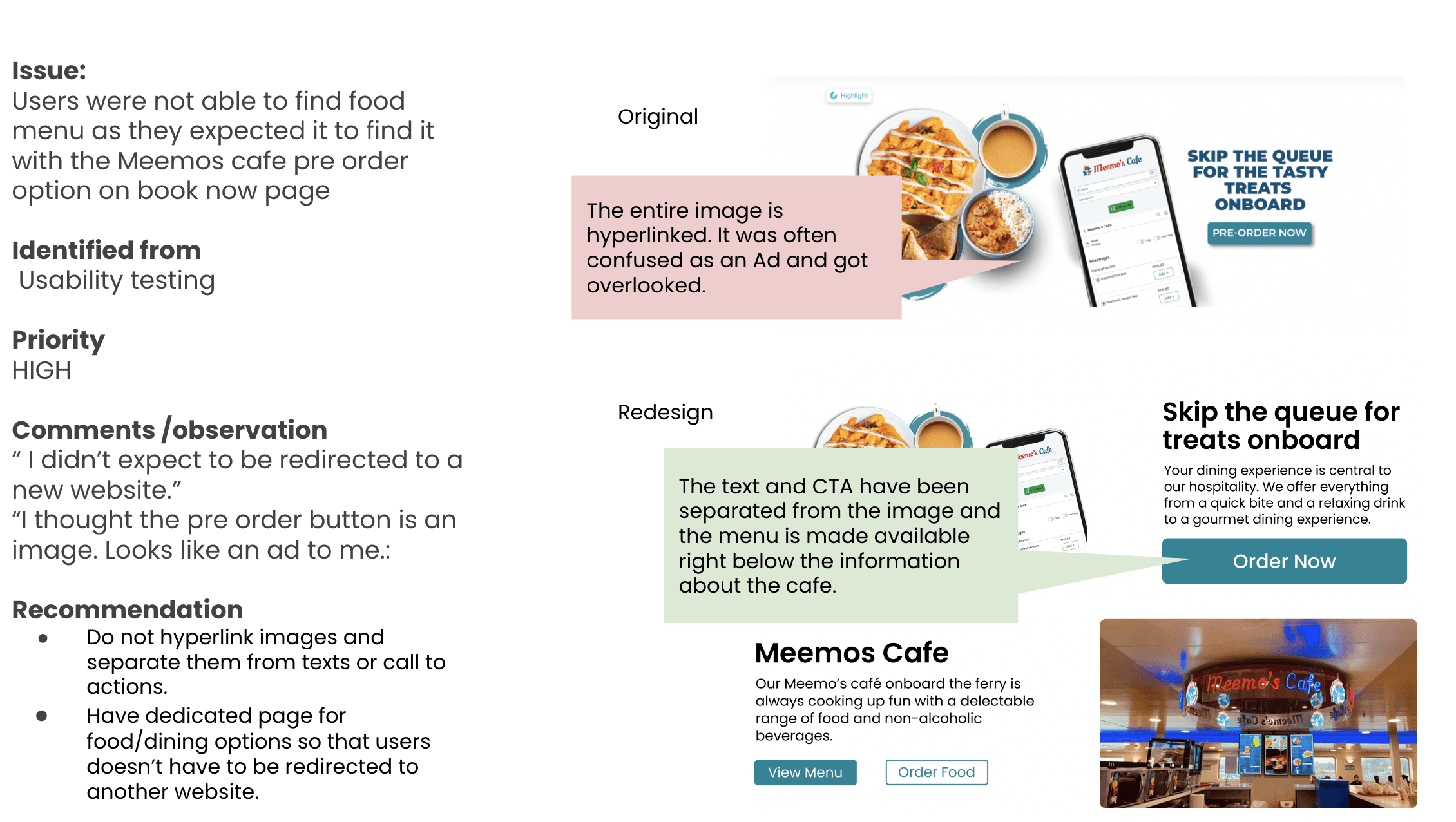
Redesign
Original


Redesign
Original

Other redesigned features
Testing and Evaluation
Testing and Evaluation
Testing and Evaluation
Redesigned features increased CSAT scores by 10%
Redesigned features increased CSAT scores by 10%
The redesign received predominantly positive feedback. To ensure impartiality, we conducted a blend of usability and split testing, alternating the order to prevent bias. Additionally, participants were encouraged to vocalize their thoughts as they compared the two designs.
The redesign received predominantly positive feedback. To ensure impartiality, we conducted a blend of usability and split testing, alternating the order to prevent bias. Additionally, participants were encouraged to vocalize their thoughts as they compared the two designs.
Original
Original
Avg Time on Task
Avg Time on Task
4 mins
4 mins
CSAT
CSAT
75%
75%
Feedback/ Comments
Feedback/ Comments
"Oh I thought I could use the progress bar to go back. That would have been so much easier tbh but nevermind."
"Oh I thought I could use the progress bar to go back. That would have been so much easier tbh but nevermind."
"What does filling fast mean? Just tell me how many slots are left."
Redesign
Redesign
Avg Time on Task
Avg Time on Task
2 mins 45 s
2 mins 45 s
2 mins 45s
CSAT
CSAT
85%
85%
Feedback/ Comments
Feedback/ Comments
"I wish the real form was like this because this makes so much sense!"
"It is good to know how many steps are there before filling out the form so that I can mentally prepare myself."
My Learnings
My Learnings
My Learnings
Simplifying doesn't mean removing everything
Simplifying doesn't mean removing everything
Simplifying things for complicated interfaces is difficult. When we communicate with others, we cannot assume they know the same information we do. Because of this, we should boil things down to what really matters. Simplicity doesn’t just clarify; it makes things better for everybody.
Simplifying things for complicated interfaces is difficult. When we communicate with others, we cannot assume they know the same information we do. Because of this, we should boil things down to what really matters. Simplicity doesn’t just clarify; it makes things better for everybody.
Simplifying things for complicated interfaces is difficult. When we communicate with others, we cannot assume they know the same information we do. Because of this, we should boil things down to what really matters. Simplicity doesn’t just clarify; it makes things better for everybody.
